The Least (and Most) Accessible eCommerce Websites
Last Updated: May 2, 2023
The World Health Organization reveal an estimated 1.3 billion people suffer from disabilities, and over 20 million Americans are living with visual impairments. That is approximately 8% of the nation’s population.
Therefore, ensuring your website is accessible to the visually impaired will not only aid these users, but benefit your businesses overall.
Businesses are becoming increasingly aware of website accessibility. Perhaps Google advocates suggesting it could become a ranking factor has gained their attention.
Here at KnownHost, we aim to accommodate whoever comes across our site. Designing our website with accessibility in mind, we understand it may still present the odd difficulty for select customers, though we continue to try and provide these users with the best experience possible.
With this in mind, we conducted an accessibility audit on the USA’s most profitable 50 eCommerce companies over the last year. We’ve also highlighted some ways these websites could become more accessible for future visually impaired users.
Our auditing process utilized two of the main accessibility evaluation tools: Google Lighthouse and Wave by WebAim.
The Least Accessible eCommerce Websites Overall
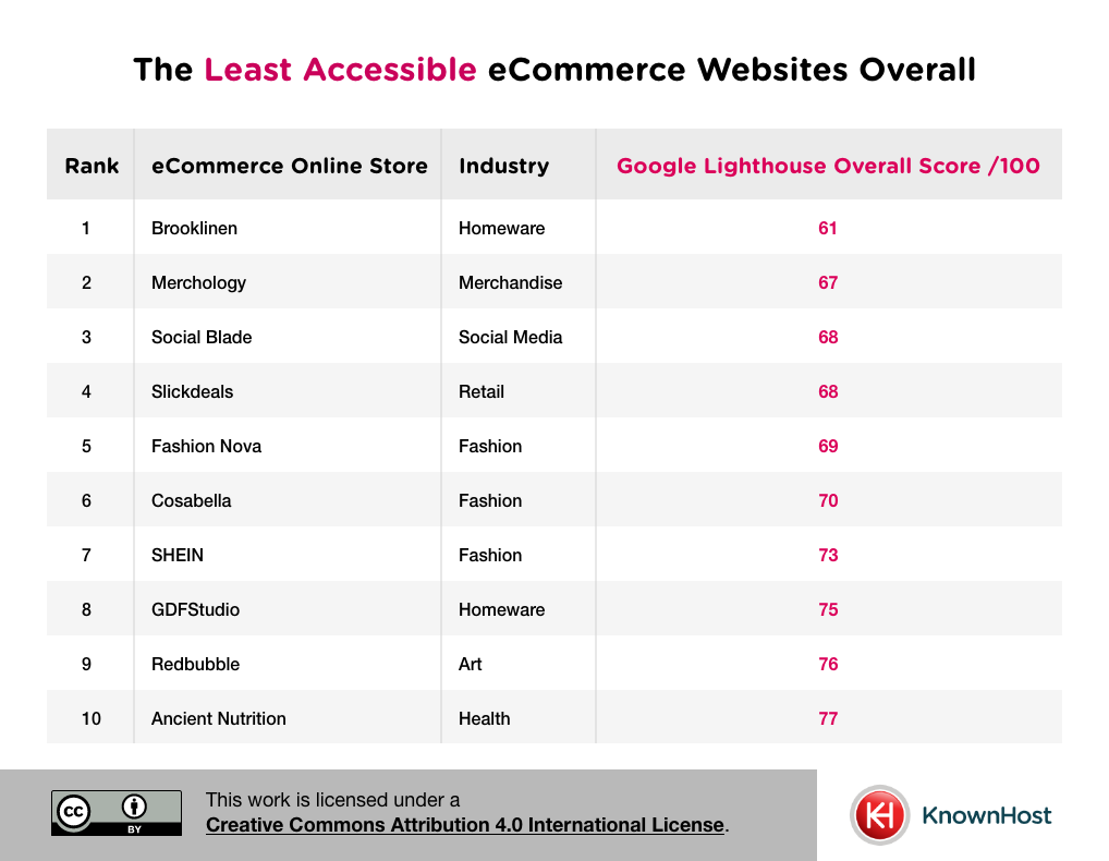
By present standards, Google Lighthouse scores below 70 should be considered to have poor website accessibility.
With a score of 61/100, Brooklinen are the least accessible website, with Merchology (67/100) just behind.
Noticeably, affordable fashion powerhouses Fashion Nova (5th) and SHEIN (7th) are among the least accessible eCommerce websites in the US. Given SHEIN emphasise their focus on equality, diversity, and inclusion, they could follow the recommendations below to cater for those with visual impairments better:
- Background and foreground colours must have a sufficient color contrast ratio
- Provide shortened and concise alternate text for linked images
- Enlarge the zoom feature’s maximum scale
The Least Accessible eCommerce Websites for Color Blind Users
Being one of the most common visual impairments, colour blindness is always a relatively simple fix for accessibility, though it’s commonly overlooked.
Wave by WebAim identifies any situations on a homepage that fail to meet these contrast ratios.
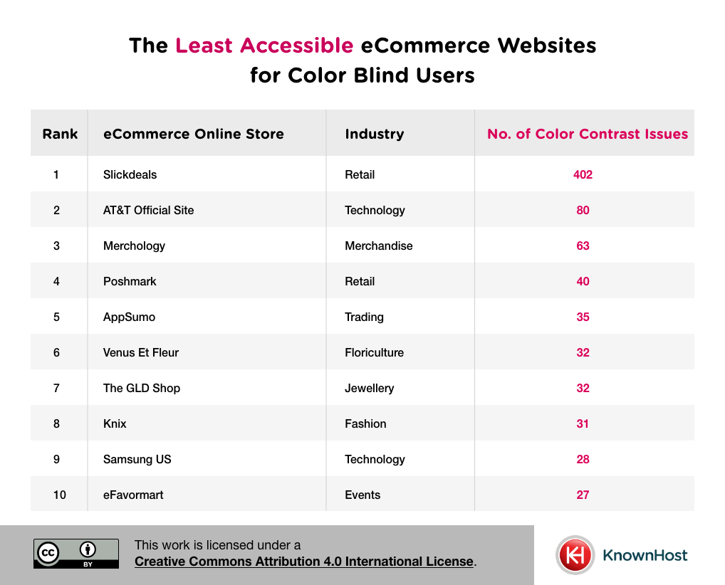
Slickdeals (402 issues) has been identified as the company with the least accessible website for colour blind users, racking up well over 300 more issues than runners up AT&T (80 issues).
Aside AT&T, Samsung are the only other technology company in this list. Samsung sustained 28 colour contrasting issues in the WebAim assessment.
The Least Accessible eCommerce Websites for Partially Sighted Users
Partially sighted users will likely access most aspects of a website with ease, though text sizing may present these users with challenges when reading.
A small text scenario is defined as any text sized at 10 pixels or smaller.
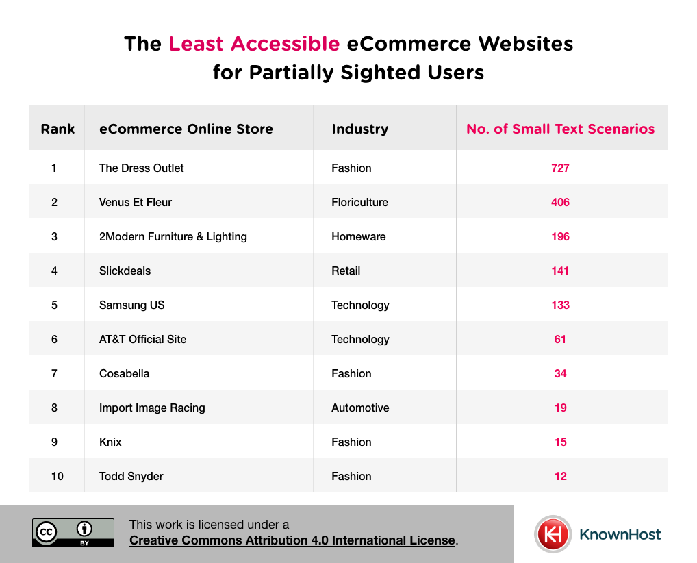
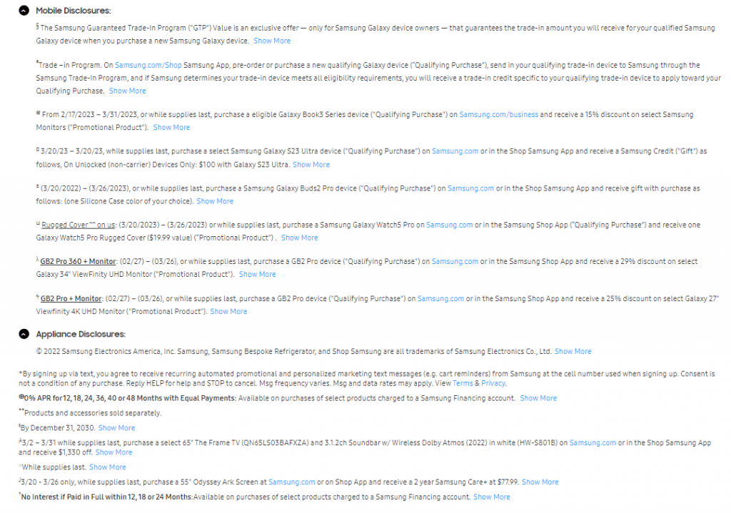
The Dress Outlet had the largest amount of small text issues at the time of analysis (727). Though Samsung (4th) attract the most attention, being in the technology industry. Looking at their website upon data collection, it appears the pricing specifications under the ‘Discover Samsung Event Offers’ may have been flagged.
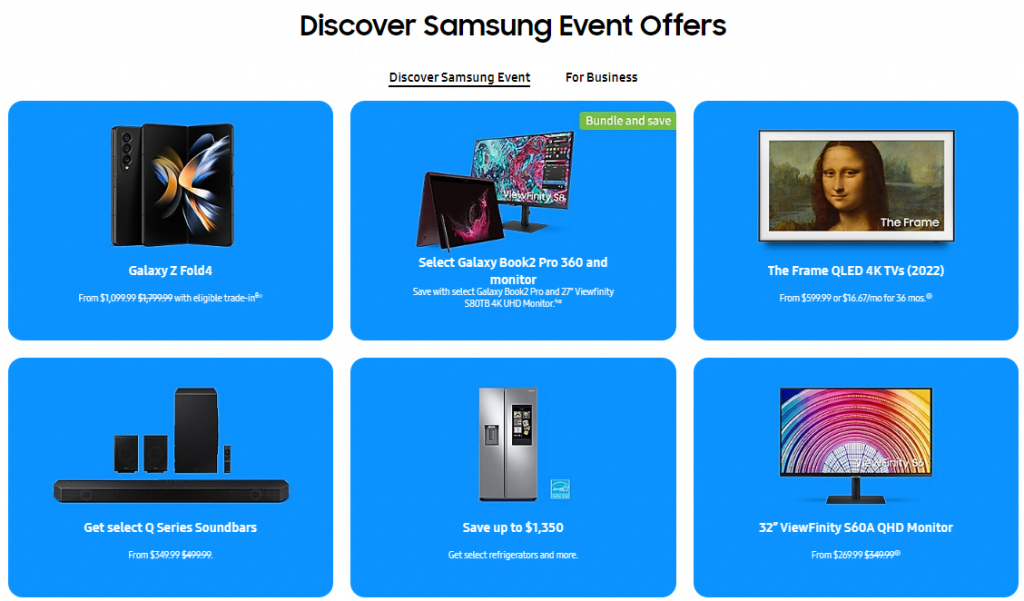
Additionally, the homepage’s ‘Mobile Disclosures’ and ‘Appliance Disclosures’ main bodies of text appear small in comparison to the rest of the page’s text.
Key Findings
Taking the time to look at your homepage to make sure it is fully accessible for those with visual impairments.
Google Lighthouse offers an initial performance score – which acts as a useful benchmark for ongoing website reviews – while Wave by WebAim identifies exactly where you might be going wrong.
The homepage is and always will be your most important page – it’s the first page most users will land on. So, you need to prioritise making the changes here. Once you have the resources, other areas of your site can be analysed too.
To summarize, these are the key findings:
- Brooklinen was the least accessible website overall
- Blenders Eyewear, Cotopaxi, Discogs, eBay, Knix, Macy’s, and Target all scored a perfect 100/100 on the Google Lighthouse overall scores.
- Slickdeals was the least accessible website for colour blind users
- The Dress Outlet was the least accessible website for partially sighted users
- Samsung were among the least accessible websites for both colour blind and partially sighted users
Methodology
We opted to analyse homepages only, as this is and always should be the most important page on any website. However, from the outset, we knew that accessibility should expand beyond just the homepage. So, our rankings may not represent the full picture.
Google Lighthouse and Wave by WebAim were used to audit all sites.
The Google Lighthouse score from 0-100 was used to rank sites overall for accessibility on mobile only.
To rank sites by their accessibility for colour blind users, colour contrast errors were identified using Wave by WebAim.
To rank sites by their accessibility for the partially sighted, all small text alerts were counted.