Most Common Dark Patterns on E-Commerce Sites
According to the FTC, dark patterns are “sophisticated design practices which trick or manipulate consumers into buying products or giving up their privacy.” There is a vast range of dark patterns which can be utilized, from hidden privacy settings to confusing cancellation policies.
The most common dark patterns include:
- Tricking consumers into sharing data: This dark pattern involves steering consumers into privacy settings which give away the most personal data. This can be done by sites having default settings which take the most data, or requiring the user to go through extra steps to reduce the amount of data collected.
- Misdirection: This dark pattern uses style or design to make one option look more desirable than another. For example, showing the subtotal box in bright green, then having any additional fees and taxes in a more muted color.
- Hidden costs: Not disclosing all costs until the very end of the purchasing process.
- False hierarchy: When giving options contrasting visual prominence will be given to steer users into a specific selection. For example, when checking out the option to create an account is bold, whilst the option to checkout as a guest is faded.
- Nagging: Pop-up boxes keep re-appearing, even after a user has closed the box on a previous screen.
- Confirm Shaming: When a user closes a pop-up another appears asking if they’re sure they don’t want to close it.
In this guide, KnownHost sheds light on the most common dark patterns being used by companies across a range of industries to show the prevalence of dark patterns across the web. We’ve manually checked the number of dark patterns across 48 sites in three separate industries to show the most common dark patterns being used.
Websites With the Most Dark Patterns
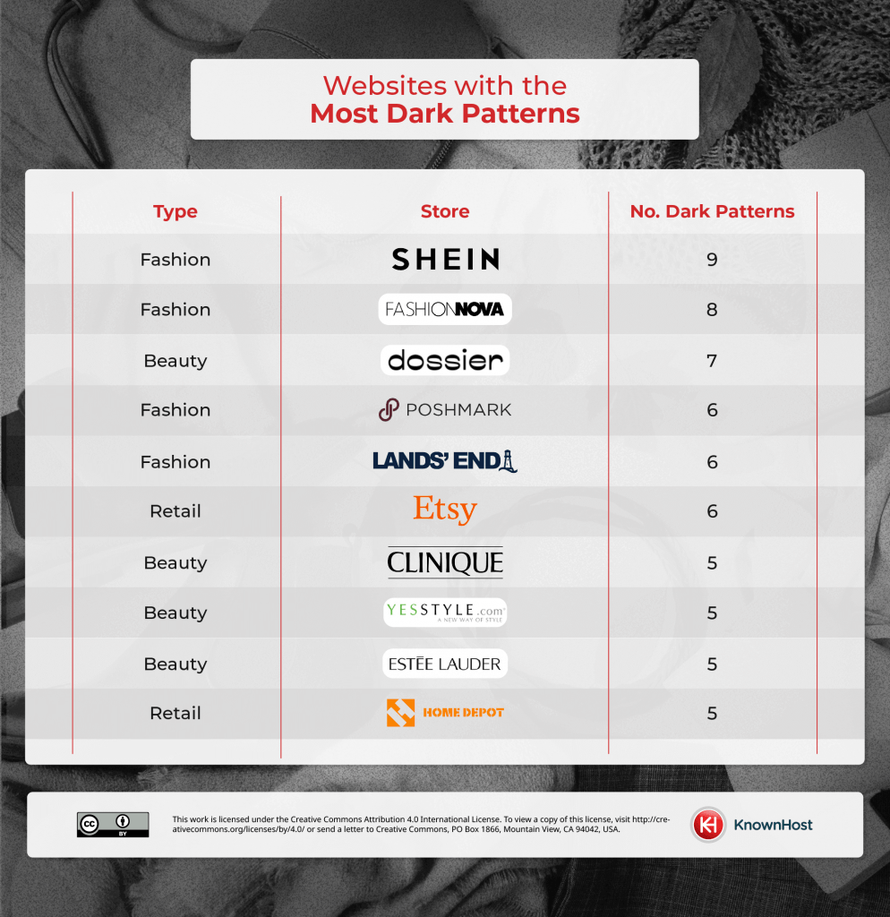
Fashion retailers dominate the top five companies with the most dark patterns. Beauty and retail sites take spots further down the table.
The fashion company with the highest number of dark patterns is the fast-fashion retailer Shein, with nine dark patterns between accessing the site and checkout. These include confirm shaming, false hierarchy and countdown timers. This creates a more stressful and rushed shopping experience.
The beauty company with the highest number of dark patterns is the fragrance manufacturer Dossier with seven dark patterns on site. The tactics this site engages in include sneaking extra products into your basket, nagging and misdirection.
The retail company with the highest number of dark patterns is Etsy, this site has six dark patterns between accessing the site and purchasing. Dark patterns Etsy uses include contact spam – getting users to sign up with social media profiles and asking for access to contacts – and default privacy settings maximizing data collection.
Other fashion sites in the top ten include Fashion Nova with eight dark patterns, Poshmark with six dark patterns and Lands’ End with six dark patterns. Other beauty retailers , including Clinique, YesStyle and Estée Lauder make use of five dark patterns each. Home Depot is the final site in our top ten also with five dark patterns.
Most Common Dark Patterns
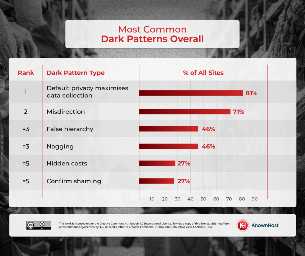
Overall, the most common dark pattern is default privacy maximizing data collection with 81% of sites analyzed requiring users to take extra steps to reduce the amount of data collection. There are a couple of common ways this dark pattern is utilized, either users had to dive into the privacy settings to change them, or users were directed to their browser settings to stop companies from collecting data.
The second most common dark pattern is misdirection, with 71% of companies utilizing it. In joint third is false hierarchy and nagging with 46% of companies using these. The joint fifth most common dark pattern is hidden costs and confirm shaming with 27% of companies using these.
Most Common Dark Patterns on Retail Sites
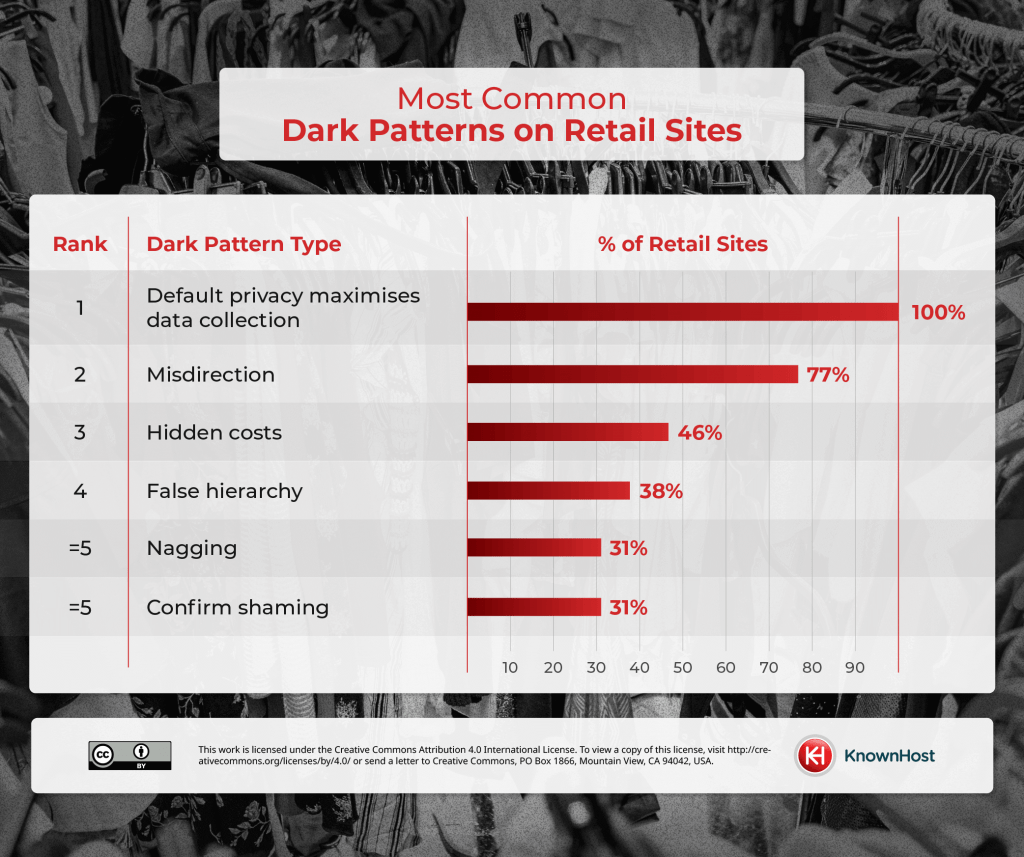
Breaking down the data by industry we can see that the most common dark pattern utilized by retail sites is a default privacy option that maximizes data collection. All the retail sites analyzed use this pattern. The second most common pattern is misdirection with 77% of retail sites trying to subtly trick users. The third most common pattern is hidden costs with 46% of retailers waiting until the last minute to tell customers their total price. In joint fifth position are nagging and confirm shaming with 31% of retailers employing these strategies.
Most Common Dark Patterns on Fashion Sites
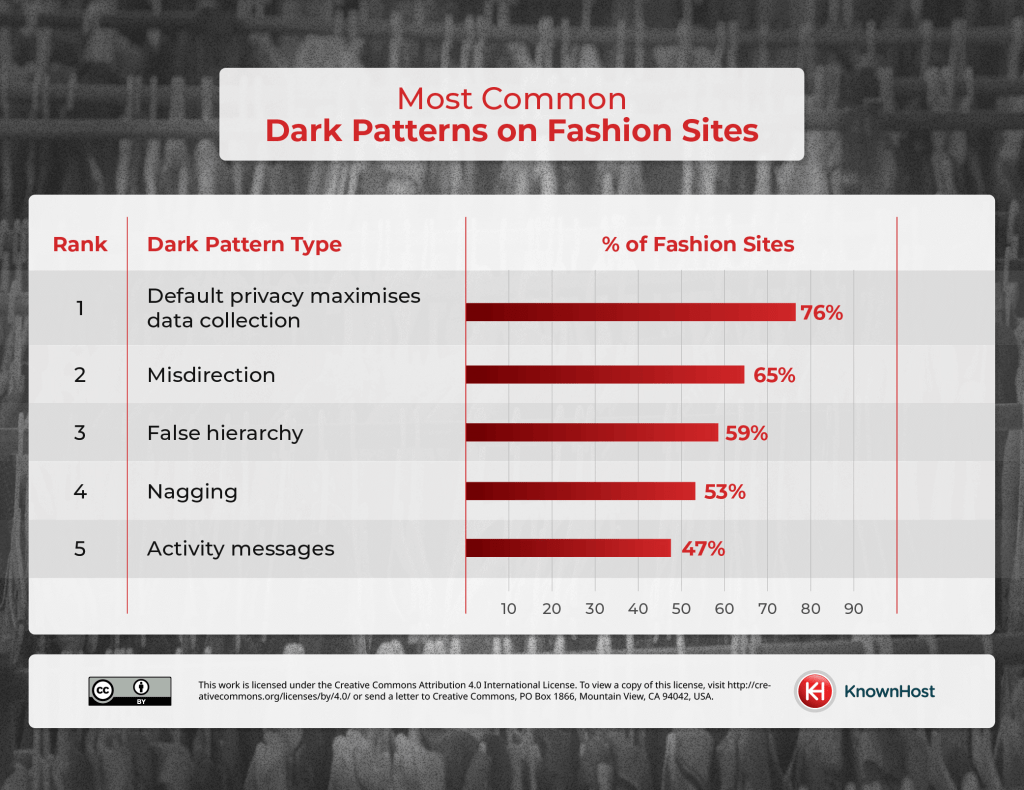
Again, the most common dark pattern on fashion sites is a default privacy option that maximizes data collection with 76% of fashion retailers engaging in this pattern. Second, we have misdirection with 65% of fashion retailers making use of this dark pattern. In third is false hierarchy with 59%, in fourth is nagging with 53% and in fifth is activity messages at 47%.
Most Common Dark Patterns on Beauty and Cosmetic Sites
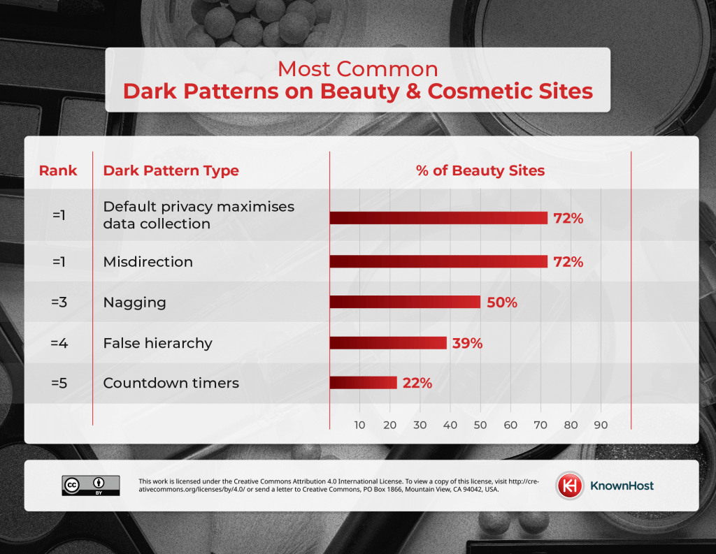
When analyzing beauty and cosmetic sites we found there are two dark patterns companies are utilizing the most, these are a default privacy option that maximizes data collection and misdirection with 72%. Fifty percent of beauty retailers use nagging while 39% use false hierarchy. In fifth position is countdown timers with 22% of websites using this dark pattern.
Conclusion
In conclusion, the prevalence of dark patterns on e-commerce sites poses significant concerns for consumers. These deceptive design practices range from coercing users into sharing personal data to obscuring costs and manipulating user choices through misdirection and false hierarchy.
We’ve found that fashion retailers, followed by beauty and retail sites, are the primary perpetrators of these dark patterns. Shein, Dossier, and Etsy are among the top offenders, employing tactics like confirm shaming, hidden costs, and default privacy settings to maximize data collection.
Methodology
Each retailer’s website was visited on 2/21/24 and scored one point for every type of dark pattern experienced from landing on the homepage to adding an item to the basket, and reaching the final step for completing a purchase. Dark patterns were taken from the FTC’s definition, with the patterns relating to retail websites being used for the analysis.