Anatomy of a Landing Page for a More Effective Email Marketing Campaign

Updated October 9, 2019
Email marketing campaigns are very effective if you have a great landing page for customers. They can entice them to purchase something, click to another page of yours, or purchase your eBook.
Your landing page should not only offer something of value but also help capture your audience for a new market of yours. However, you should ensure your landing page is created just right.
Create Landing Pages that Flow with Your Business
There are just as many types of landing pages, as there are methods to promote them. The key to providing the best landing page is to ensure it flows with your business. The most important thing to ask yourself is: what is it you want your customers to do.
Do you want your customers to register for an upcoming webinar, buy your eBook, complete a quote, or opt in for a report? Whatever it is you want them to do, it should be evident to your customer. See also: Improve Your Email Signups with These Simple Tips
Create Custom Landing Pages
Think of all the traffic mediums to get a customer to your landing page: Facebook, Twitter, AdWords, organic search, and of course, email subscribers. Each one is a unique marketing strategy and capturing different audiences.
Treat Your Traffic Sources Differently
Since each would come from a different traffic source, you can’t treat them all the same. You need to create a custom landing page for each source. To start doing so, create one main page and tweak it from there.
For example, your Facebook followers may be an older group while your Pinterest followers may be house-moms. Each landing page would need to be customized for each group. Your Pinterest followers may do best with quality images or an infographic while your Facebook followers may prefer video content.
Make a Clear Call to Action – Immediately
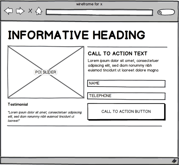
There are two parts of your landing page: above the fold content and below the fold content. The above the fold content needs to show your customer a clear call to action. It should be readily visible, so they don’t have to scroll far to find out what you want them to do.
Therefore, your opt-in box, report to download, or option to purchase your eBook should be right there. This would almost guarantee a higher conversion rate since they don’t have to search for what they need to do.
Steer Away from Other Navigation Tactics / Offers
You also do not want to give your visitors too many options. Offering tactics and offers where they can navigate off your landing page is a major mistake. Leave this out for them after they’ve completed the action you want them to have done.
Give Them Valuable Information and Entice Them to Want More
Now, once they are on your landing page, the above the fold content should also have valuable information to keep them attracted to your page. Besides showing them what you want them to do, they need a good reason to do it.
A simple, enticing title may not work. Explain why it’s useful to them. Tell them what they will learn or receive.
Remember also that some readers are hip to this game, so they may skim your content. This means you need to present clear, concise information. Don’t overload them with wordy content. Use headers, formatted text, and white space wisely.
Create Urgency
Creating a sense of urgency is necessary! Your readers must not feel they can come back at any time, just to have forgotten they wanted to. You need to either imply a sense of urgency or create a sense of real urgency.
You can imply a sense of urgency by stating terms such as “Act Now” or “Buy it today”. You can create a sense of real urgency by stating terms such as “Limited Time Remaining” or “Only 3 Left”.
Test it Out
Now, you can’t do all this work and expect it to just work. Test out your pages. There are so many factors, of which you can test, including the design, opt-in forms, web copy, colors, headlines, and more. Using the right landing page can greatly increase your conversion rate.
One of the more popular testing methods is the A/B split test. This means splitting your traffic between two versions of your page. Co-founder of KISSMetrics, Neil Patel describes 50 split testing ideas in his blog post. He believes A/B split testing is the only way to improve your conversion rating.
Therefore, as you can see, your landing pages are not black and white. There are varieties of factors that will make it unique to your visitors.
So just because you have captured their email address, it does not mean they won’t opt out if they don’t see the value of the upcoming landing page. Give them a reason to stick around and find out what more you have to offer. Customize the experience for your email marketing campaign than from other campaign efforts.

Looking for web hosting? Look no further! KnownHost offers Web Hosting, Cloud Hosting, Managed VPS and Dedicated Hosting to suit any budget – all with proven best uptime on the planet! Check out our plans and pricing here!
Pavan
March 16, 2017 at 10:21 amHi,
I want to know whether knownhost will support for campaign if it supports how well it works.
Pavan
March 16, 2017 at 10:23 amHi,
How many IPs will knownhost provides for first time purchase.